Gibb Slife: Returning to the Photograph

The art of collage is the centre of Gibb Slife’s practice. He seeks to challenge what might be perceived as ordinary or mundane. From painting to sculpture, Slife’s work always reverts back to the origins of the photograph.
Born in 1975 in Cleveland, Ohio, Slife received his BFA from Rhode Island School of Design in 1997. Solo exhibitions of Slife’s work have been mounted at galleries in New York, Paris and Zurich. Group shows include presentations at MOMA P.S.1, the National Design Museum, White Columns and Gagosian Gallery, all in New York. Slife works between Brooklyn, New York, and Brabant-Wallon, Belgium.
FRONTRUNNER spoke to Slife about his artistic beginnings, his fascination with imagery, and what this means for his future works.

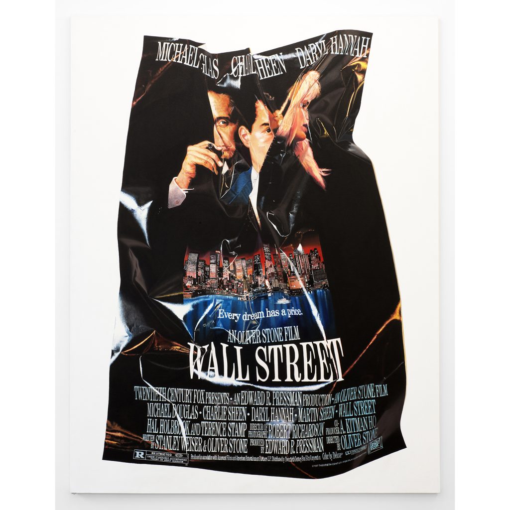
Wall Street (2014)
Oil on canvas
90″ x 70″
Courtesy of the artist
Tell us how you began as an artist.
I’ve always been interested in collage, and that’s always played a part in my painting. So, that’s where it all started basically. There’s always been some aspect of the photograph that’s used, whether it’s silkscreened, painted – or just simply collaged.
Your work incorporates a wide range of mediums such as painting, sculpture, and mixed media. As your art has developed, is there a particular medium that you enjoy working with the most?
There has been a diverse range over the years, but I always come back to painting – so, it’s pretty basic. I’ve always had a minor in sculpture and sort of a major in painting, if you will. But Its oil paintings – that’s the thing I enjoy doing the most. As of late, I would say I just look for images in books and on the computer, and then I assemble them and make theoretical fictions out of them. I then wait and see which narrative comes from that. It’s an intuitive process.
Are there any materials that you can’t live without in your studio or workspace?
Yes. But again, it’s back to the basics. It’s oil, turpentine, and canvas. Those things I have to have. When it comes to the painting, there’s very little else that’s involved, and I think there’s still so much to be said with it and so much use that you can get out of it. I try to keep any digital experience to a complete minimum.

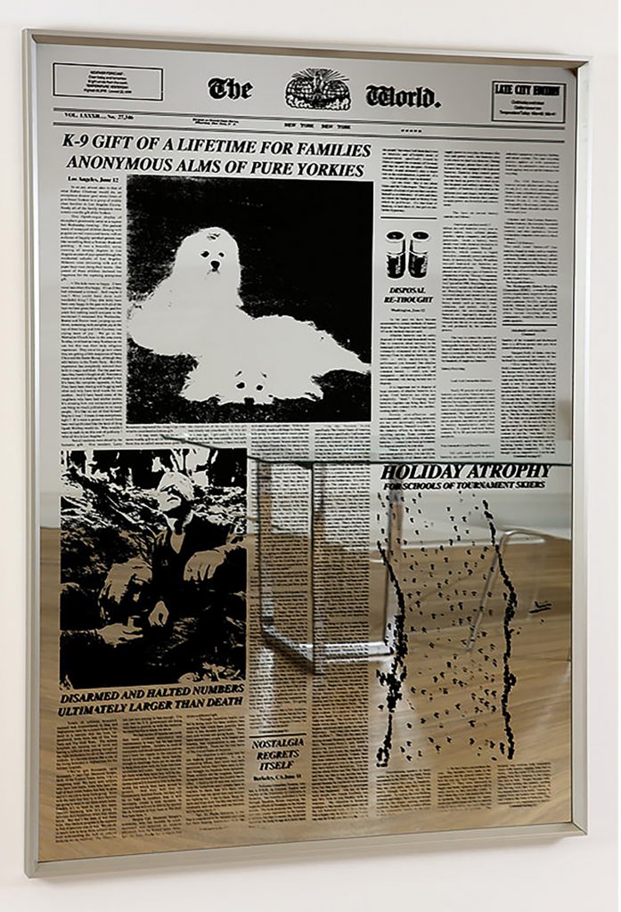
Untitled (The World #2) (2008)
Silkscreen on Perspex mirror
63″ x 48″
Courtesy of the artist
Some of your work seems to be largely influenced by pop culture. Top Secret, Casino, and Wall Street (2014) all refer to specific films. What do you look for when choosing a film or celebrity to feature in your work?
Well, they’re very well-known films. I wanted to start with something that was well-known so that the changes that I made to it would be the thing that you notice. Because you already know the images so well, and so I wanted to limit myself specifically with those to not cut, not add paint, not manipulate in the traditional collage sense – but just to fold and to see what happens when it becomes more of a sculptural thing. They’re sort of like John Chamberlain sculptures in a way, to try to find a new narrative that can come out of them. As movie posters, what they are encapsulates the narrative of what the movie is about. In the case of Wall Street, the folds sort of create these bizarre, Picasso-esque characters, and I just try to create something different out of it.
You seem to have a fascination with texture in your work. Would you agree?
Yes, I would. Maybe the Picasso reference is not the best one, actually. It’s more John Stezakar, probably. He cuts. His are folded, but there’s sort of a similarity, there.
Your Mirrors series employs silkscreen on Perspex mirror. What was your intention behind this series?
The very first of that series I did were much smaller – in 2006. They were much more of a cut-out type operation. I would chop up the headlines and then create new headlines. The later ones which are bigger that you’re probably referring to – I would just invent the headlines. I would find an image and that would suggest the headline. All that text is written out – If you can read it or not, it’s all there.
Was there a political message that you were trying to get across? Or was it purely going off of what the images said to you?
Yeah, I was really trying to create something that was surreal. But as we know in the news today, it’s sort of impossible to get past what’s already surreal. Then the mirror aspect of it was sort of trying to create a commemorative object out of it. And also, the fact that you’re distracted by the fact that you’re reflected in it as you’re trying to read it.
I was particularly drawn to your sculpture, especially The Fact Checker (2012). What was your thought process when creating that piece?
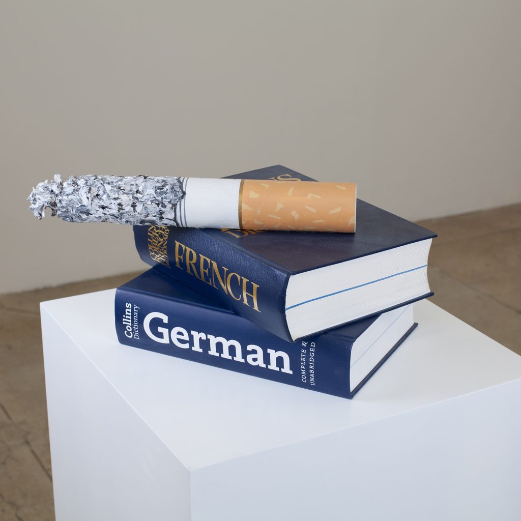
That cigarette was carved out of basswood and then painted. It’s really about as much as anything I’ve done – it’s about fact checkers. I worked at The New Yorker for a number of years. I’d go in their offices and they’d have ashtrays just filled with cigarettes. They’d been working all night, referencing different things and so that’s the two language dictionaries there. So yeah, that was fun to do. I think more of those could be in the works.

The Fact Checker (2012)
Basswood, acrylic paint and two foreign language dictionaries
22″ x 12″ x 10″
Courtesy of the artist
Tell me more about Reception (2006).
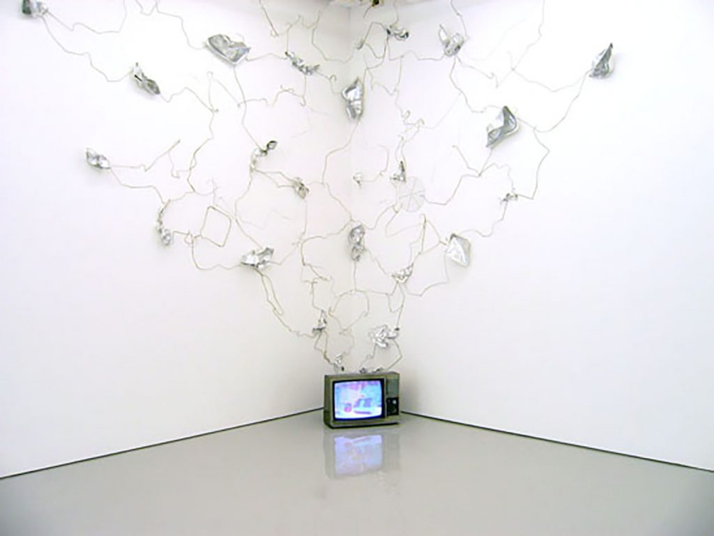
The inspiration for the TV piece was that I had gone into a bodega one night and they had dug wired this thing up to get the best reception they could. I thought it was beautiful – so I thought I’d try recreating it but really embellish it. A lot of things do come out of everyday objects. The movie posters are everyday objects, as well. Newspapers are everyday objects. I suppose that’s all rooted in Pop art.
You have featured a variety of art forms in your work such as fashion and architecture. Your work does not seem to fit into a specific category or genre. How would you best describe it?
That’s true. I have historically done a lot of jumping around but it’s always what the thing called for. It’s always been if I had an idea – it would be best as this. I never wanted to stop myself and say, “no I don’t do that” – you know? The fashion stuff is out of left field in a way, but it’s all still part of some greater narrative, which is what my work is about. I probably couldn’t describe it in a few words. But it’s all there.
Interesting. So, you don’t limit yourself to anything, you just go with where your ideas have led you, regardless of the medium?
Absolutely, yeah. That can be a struggle as well, because people only have a certain amount of attention sometimes, and if you’re moving around a lot, it’s sort of difficult to get across. But there it is.

Reception (2006)
Color television, coat hangers and tin foil containers
22″ x 20″ 12″ x 144″
Courtesy of the artist
What are you working on at the moment?
I’m working on a new series of paintings that are mostly inspired by the German art historian, Aby Warburg. He would seemingly not manipulate images at all but just assemble them and see what kind of narrative would be created – just by assembling them and not mediating or altering the images in any way. So, I like that sort of restriction that he put on himself, and that’s what I want to try and do as well – just to see what the images do with each other. There’s been a big history of collage in painting. But, in many cases, it’s mediated by smears of paint, or different textures, or silkscreen and painting – or even just line work (a combination of all those things). And I’m restricting myself in the same sort of way that he did.
So, you want to strip it back a bit more, removing the influence of other elements?
Right. So typically, there would be 4-5 or 6 images taped to a work board that I have in my studio, which is made of plywood. And then when I get the right combination, I make a painting from that.
What advice would you give to young, aspiring artists trying to break into this industry? Which advice would you tell them to ignore?
As much of a cliché as this sounds, my first thing would say go with your gut. Like I said, it’s a cliché, but you’d be surprised at how many people don’t and have to remind themselves of that lesson. The second part of that which is the “don’t”part is to be aware of trends and beware of trends. Not all trends are bad – but they can be insidious to some level. So, really, those two things are the same thing.
What do you find most enriching about working as an artist? Is there anything that you feel is currently missing in today’s art culture?
That’s a good question. The art world is very splintered these days – but that’s also reflective of society in general. People are so opposed to each other, away from each other and that is reflected in art. Probably what’s missing is a coherent dialogue maybe? That’s always been sort of impossible to achieve, but now it seems even more splintered. Maybe there’s not one art world; there’s many separate art worlds.
Do you have any specific goals that you would like to achieve in the short term?
I would like to show this new series when it’s ready. Since I’m living in Europe for two years, the next exhibition will probably be in Paris. But, depending on the pandemic, we will know later when that can be scheduled – so that’s the immediate goal.
Responses