Special Guest Post: Stanley Kubrick at The Design Museum, London
In the pantheon of legendary filmmakers, Stanley Kubrick is amongst the most revered. The American auteur, who died twenty years ago, is noted amongst cineastes for a series of films which redefined the medium, and are often upheld as examples of the best that the motion picture has offered the world, transcending popular culture to be regarded as high art. So it is appropriate then, that Stanley Kubrick: The Exhibition finds a home at London’s Design Museum in Holland Park. The UK arrival of this much-vaunted exhibition is also fitting as its subject spent most of his career living and working here. A committed Anglophile, Kubrick moved to Britain in 1961 to escape the onerous controls of the Hollywood studio system and his own fear of, what he saw, as a rise in violence within the American urban landscape.

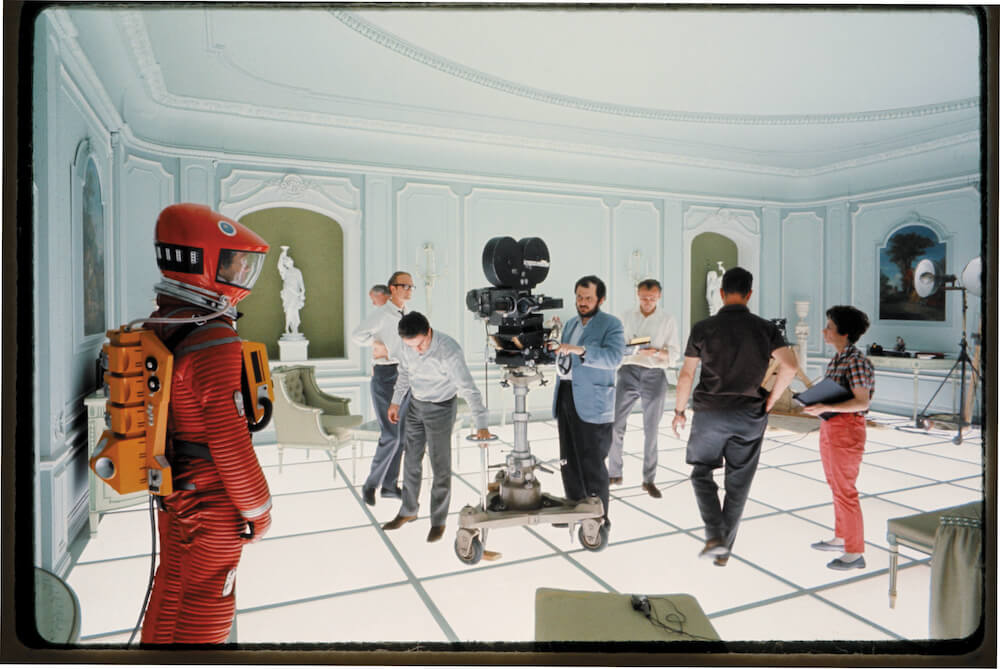
2001: A Space Odyssey (1968)
Dir: Stanley Kubrick (GB/United States)
© Warner Bros. Entertainment Inc.
For its London run, Stanley Kubrick: The Exhibition has experienced some tweaks to its content to reflect this duality. The exhibition is accessed through a walkway carpeted by the iconic design from Kubrick’s horror masterpiece The Shining (1980), surrounded by high-definition screens playing highlights from his cinematic oeuvre; soundtracked to the strains of Also Sprach Zarathustra by Richard Strauss, as featured in 2001: A Space Odyssey (1968). Both of these films figure heavily in the exhibition, and this introduction acts as a signpost to their significance in both the display and in Kubrick’s filmography. The clips used demonstrate Kubrick’s preferred “one-point-perspective” technique, immediately highlighting his individual style for the visitor.
The first room of the exhibition, proper, is based around Kubrick’s workspace – artefacts such as examples from his extensive files (including of the infamous, unmade Napoleon project), his 1969 Best Visual Effects Academy Award, as well as clapper boards, cameras, shooting schedules, and a wide array of ephemera encompassing his entire career. Also included are examples of his photography for Look Magazine, where he honed his skill for capturing an arresting image.
What comes through most vividly in this portion of the exhibition is the magnitude of control Kubrick exerted over his productions, and the minute level of detail he delved into whilst researching his projects (even for those that went unrealised). A notable highlight in this room is a recreation of Kubrick’s editing desk, representing the aspect of filmmaking that Kubrick believed to be the most important. Indeed, critiques of Kubrick’s films have often dwelled upon the ingenuity of his edits, most famously the match cut in 2001: A Space Odyssey that portrays human evolution over millennia in a split second of celluloid.

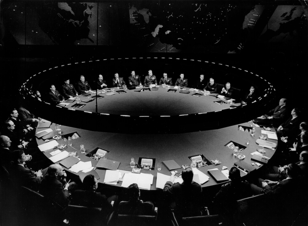
Dr. Strangelove or: How I Learned to Stop Worrying and Love the Bomb (1963-64)
Dir: Stanley Kubrick (GB/United States)
The Conference table in the War Room
© Sony/Columbia Pictures Industries Inc.
The remaining rooms deal with each of his major works, but rather than enact a strict chronological approach to his career, the exhibition’s curator Deyan Sudjic has employed a thematic approach. Thus, Kubrick’s war films – Paths of Glory (1957), Spartacus (1960), and Full Metal Jacket (1987) – are considered as a loose trilogy. This section also illuminates the move away from the studio system and towards total creative agency. Spartacus, in particular, is used to demonstrate this having been a passion project of its star Kirk Douglas, with Kubrick brought on as director to replace the ousted Anthony Mann. Even here, a large reproduction photograph of Kubrick preparing an epic battle scene shows the level of control he could exert over a major production: each one of the hundreds of extras is numbered so that individual direction could be tasked. The production of Spartacus was a tortuous one for Kubrick, and his move to the UK followed shortly thereafter. The results of his insistence of absolute control over future projects are most clearly seen in the section relating to his Vietnam War film Full Metal Jacket, where he recreated the wasted city of Hue in London’s Docklands – complete with the import of 200 North African palm trees. Augmented by original props and posters, the mise en scène of Full Metal Jacket is arguably best represented with the inclusion of work from renowned photographer Don McCullin, whose iconic image Shell Shocked US Marine, The Battle of Hue (1968) is given prominent placement.
The exhibition then examines Kubrick’s most controversial films: Lolita, Dr. Strangelove: Or How I Stopped Worrying and Learned to Love the Bomb, and A Clockwork Orange. It is the latter film that dominates this section, with costumes and props from the film presented alongside examples of the Brutalist design movement that influenced the look of the film. Also included are examples of designer Allen Jones’ transgressive works, reimagining the female body as furniture pieces for the film’s Milk Bar. Throughout this section, there is a balance between the controversy of A Clockwork Orange’s violence with a critique of the aesthetic that encourages it. This is a fascinating stretch, and perhaps the section with the strongest impact, felt long after the visit is complete.

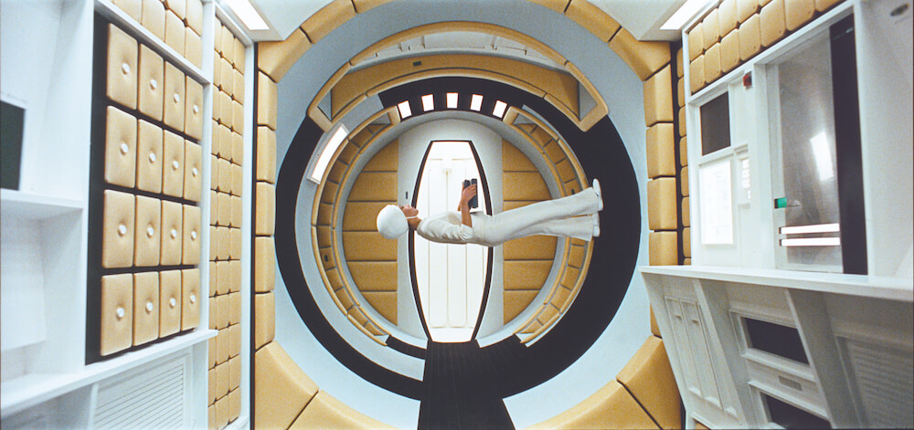
2001: A Space Odyssey (1968)
Dir: Stanley Kubrick (GB/United States)
© Warner Bros. Entertainment Inc.
There are, however, sections even more impactful in an immediate viewing. The size and scale of the model maze from The Shining, as well as the twins’ costumes and the reams of typewritten paper reading, “All work and no play makes Jack a dull boy” (translated into several languages for overseas territories, again revealing the meticulous levels of detail that Kubrick oversaw) will excite the cinematic fan. It is the final room, though, dedicated to Kubrick’s 1968 masterpiece 2001: A Space Odyssey that truly takes your breath away. A recreation of the futuristic Hilton lobby on Space Station Five – complete with the instantly-recognisable red Djinn chairs -dominates the space. Also featured are original props including the rarely-seen ape costume from the opening scene, meticulously detailed model spacecraft, and examples of the core research into creating a realistic vision of space travel…a year before Neil Armstrong stepped onto the surface of the Moon. Two key objects stand out more than the rest. The Star Child model and the HAL 9000 unit, two of the most indelible cinematic impressions, displayed right before you is a thrilling experience.
Stanley Kubrick: The Exhibition is a fitting tribute to a masterful filmmaker, an obsessive creative mind, and a genuine twentieth century artist.
This review of Stanley Kubrick: The Exhibition will appear in FRONTRUNNER’s Winter edition, coming out in January 2020.


