

Andy Mister: Reproduction & Representation
Tell me about your interest in photocopies and the look of reproduction.
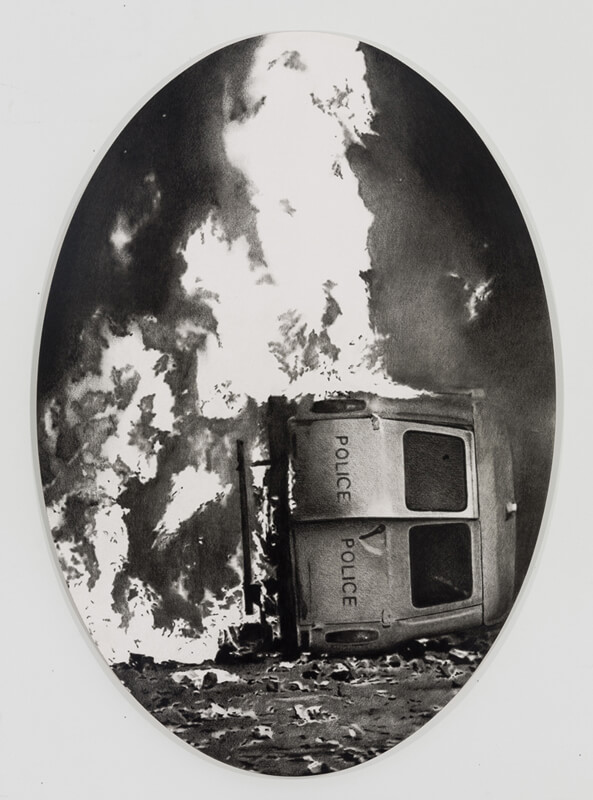
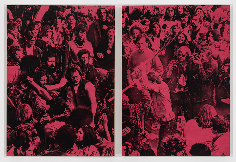
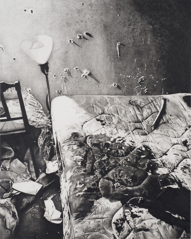
Growing up as a kid who was into punk rock, the visual aesthetic of the photocopy was always present. It wasn’t until later that I began to associate that look with the work of artists like Warhol and Cady Noland. In my own work I’m interested in the way that different forms of reproduction imply or strip away meaning. I take a lot of images from history books, there’s a certain kind of printing that you see a lot in them that seems to imply a certain historical weight or content, even if it’s not actually there. Even if the image has no historical documentary significance.
You spent time looking at the uniformity and layouts of old magazines. There was an authority in old Time Magazine layouts I feel. What influences your cropping of images?
In general I’m interested in taking content that was meant to document something historical and re-cropping or framing it in a way that is more aesthetic and less documentary, to undercut some of that “authority.”
How does having a narrative explicit in the image’s content play a part in the artwork’s reception?
I guess a lot of times the narrative is outside the image. The narrative is found in a caption or a supplementary text. So if you remove that and just present the image, then it is up to the viewer to infer the narrative, or create one out of whole cloth. Creating that ambiguity and giving up that control of the drawing’s reception is often what I’m after.
The psychology of entering a gallery is interesting. Why do people stop and stare? How do you present your work considering art signifiers such as paper or canvas, and a print, painting, or drawing.
Most recently I’ve been mounting my drawing to wooden panels to blur those distinctions. They then hang in the gallery like paintings, the wooden support gives them a heaviness that is almost sculptural, but the surface is still paper so there is a softness. I really like that ambiguity of materials, which hopefully forces the viewer to interact with the surface of the drawing.
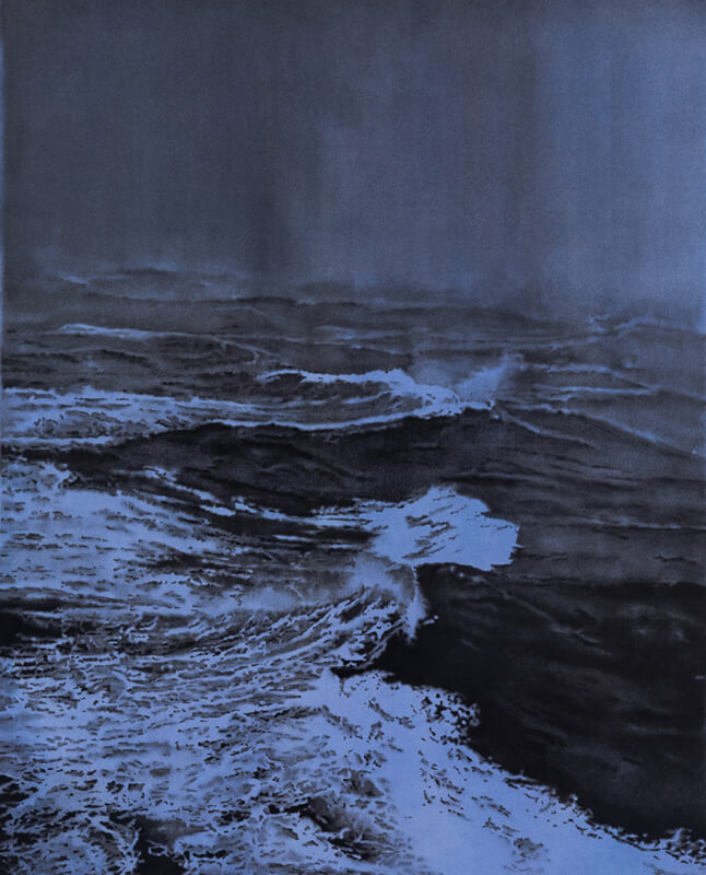
You are working on a series of environmental pieces. What inspired a change in subject matter?
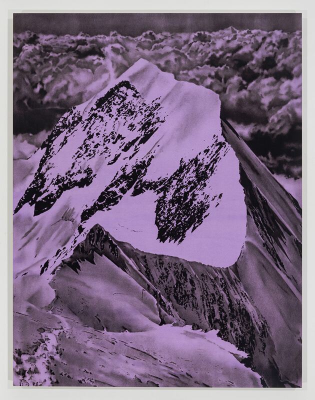
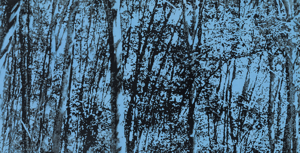
I did a few drawings of foliage that were blown up details from photographs from the Vietnam War. After those I became interested in making drawings of the natural world, which I’d never really done before. I began to think in terms of classical landscape painting, but using the visual language of the Xerox that has always spoken to me. In some way I think of these drawings like elegies for the natural world that’s being destroyed—if that’s not too melodramatic.
The color of the background. How do you decide this. Is there a kind of audition step in the process or is does the background color come before the content is chosen?
It’s a pretty intuitive process. There’s no real rhyme or reason behind which color I use for a drawing. A few years ago I got tired of just making black and white drawings and started experimenting with different ways of toning the paper before I drew on it. At first I was mostly using colors that I remembered from punk albums when I was a kid, pink and yellow, etc. Then I started using fluid acrylic paint and mixing my own colors, and the whole spectrum really opened up for me. Mostly the color combinations are inspired by old book and album covers. I’ll see something I like and try to recreate it in a drawing.
Andy Mister has a solo show called “Vanishing Point” opening at Hirschl & Adler Modern on March 23 (thru April 29).


Responses