

One Beguiling Belgian: Jean-Baptiste Bernadet
It’s tempting, but don’t be so quick to call Belgian artist Jean-Baptiste Bernadet an Impressionist. Writhing and buzzing with colour splayed out in immediate, tactile brushstrokes, Bernadet’s work crosses in and out of several disciplines. Based in Brussels, Bernadet’s work has rippled its way into the spotlight with exhibitions hosted in New York, Paris, London, Madrid, Miami, Tel-Aviv and Geneva.
His solo exhibition at Valentin Paris, Solarium was fresh off a series of paintings called Fugue shown almost back-to-back at Alon Segev in Tel-Aviv and Rod Barton in London (who first displayed the series back in 2014 at NADA NY). Bernadet, blessedly, does not mince words when describing his aims and practice, at large.
I first saw your work with Rod Barton at NADA NY (I think it was in 2014) and thought it might be some kind of sick joke: who goes around photocopying a Monet?! And in a strange reversal of Impressionist viewership, I got closer to the works and found more (not less) objective volume. To what extent do you accept or reject the inevitable, commonplace gravitations towards Impressionism with works like these or those in your 2014 show Fugue at American Contemporary?
I think that feeling often comes from an online viewing first, which is fine, but in my opinion doesn’t reflect the reality of the work. There are three things that remind me of Monet and Impressionists, in general. First, all of these paintings have a sort of landscape-y feel and in Monet’s paintings (especially the lily and pond scenes) you never really know what’s up or down, viewed from above or the front, and you barely have a sense of scale. Second, the way I install these paintings, especially when the room allows me to install them side-by-side, is of course reminiscent of the way Monet himself had installed his paintings, at the Orangerie, for example. It’s a common ambition of going beyond the canvas and to work on an environmental scale. Lastly, I feel like I’m an impressionist on a very basic level; I’m depicting sensations and impressions. I’d rather call myself a “sensationalist”, if only the word was not so ugly and not so attached to any kind of movement that was not so irrelevant today. On the other hand, I feel that my palette is not impressionist at all…closer to a RGB flickering or even a CMYK printing process than the late 19th Century. The process matters, too, more than the “subject”. There’s a performative aspect in my work that already exists in any kind of painting in history, but there’s an emphasis on that in my work, which I feel is very contemporary. Exhaustion, cover-up, perpetual editing and a never ending process.
There can be no denying that your work is rooted in physical gesture. I find this very comforting in a landscape increasingly populated by mechanical reproduction or purposefully dumbed-down attempts at Minimalism. Your work alongside Joanne Greenbaum at Michael Jon & Alan (Miami) was startlingly tactile. Can you tell me more about the production of work for that show?
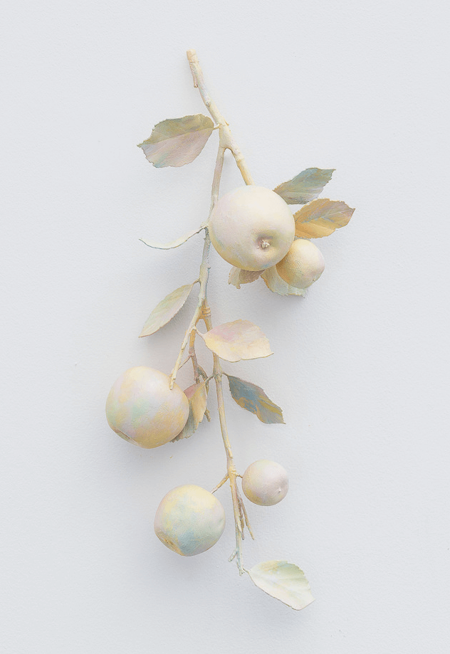
Those paintings on wood were made on relatively small scale compared to my other bodies of work, it was a way to maximise the effect of the brushstroke work. On the larger works like the Fugues, every brushstroke matters, but they are building and animating a field. Whereas on smaller works, you can clearly read all the interactions between these same brushstrokes. Viewed from afar these smaller paintings are just glowing, vibrating, and when you get closer what you see is “just” brushstrokes without any sense. I have always been very interested in chance, accidents, and how you can work with that. It’s way more visible in small works than in larger ones since I’m always using the same brushes, no matter the size of the painting. Also, I painted these on wood panels which were framed before I started to paint on them, so you can see the physical limit of the works. Most of the time the frame, itself, is partially painted, showing the physical limits of the work instead of a seemingly never-ending field. In that way I think they have a sculptural feel, in the same way the Apples I have just shown in Paris are paintings with a sculptural aspect (but still they are paintings).
Tell me about colour production: is your interpretation of colour (once it hits a chosen surface) a changeable, flexible concept or do you have a set of established rules in how you utilise colour?
There’s absolutely no rule in my work, it’s more the product of an experience. To me, painting is a language; you build it over time and through failures and attempts, and slowly you establish not rules but you build your own tools and grow a vocabulary. An artist’s work (the totality of his/her production) is a singular language that has its own words and elements. The more words you have available, the more you can play with them and make better sentences, more precise ones. After 15 years of working, I understand that some of these words can be described as permanent or prominent, but maybe it’s a job for an art historian to translate them.
I get the sense that the physical orientation of your works is quite important once it is arranged within an exhibition. True? False?
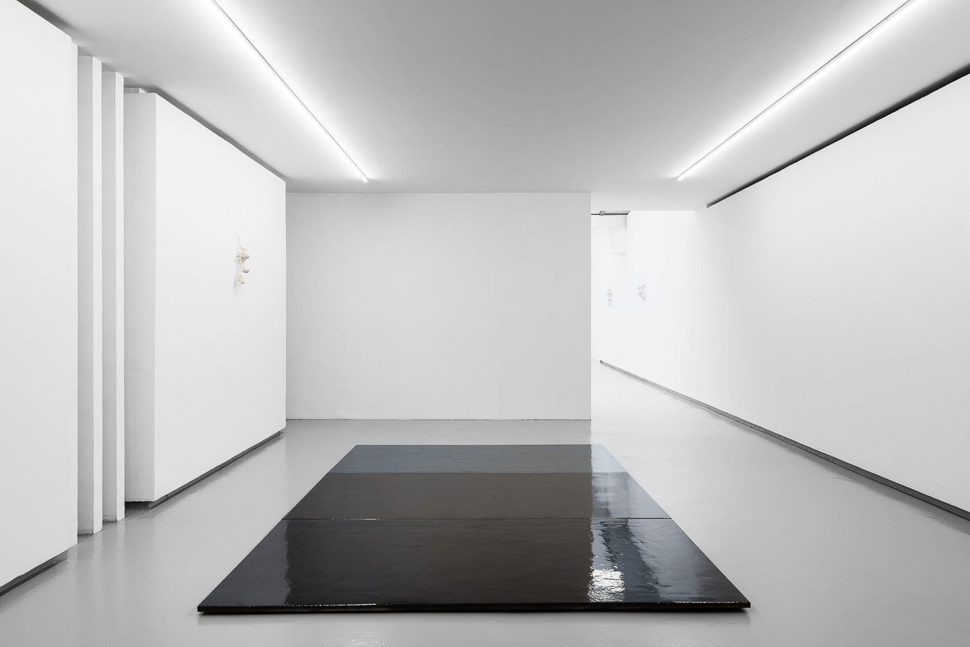
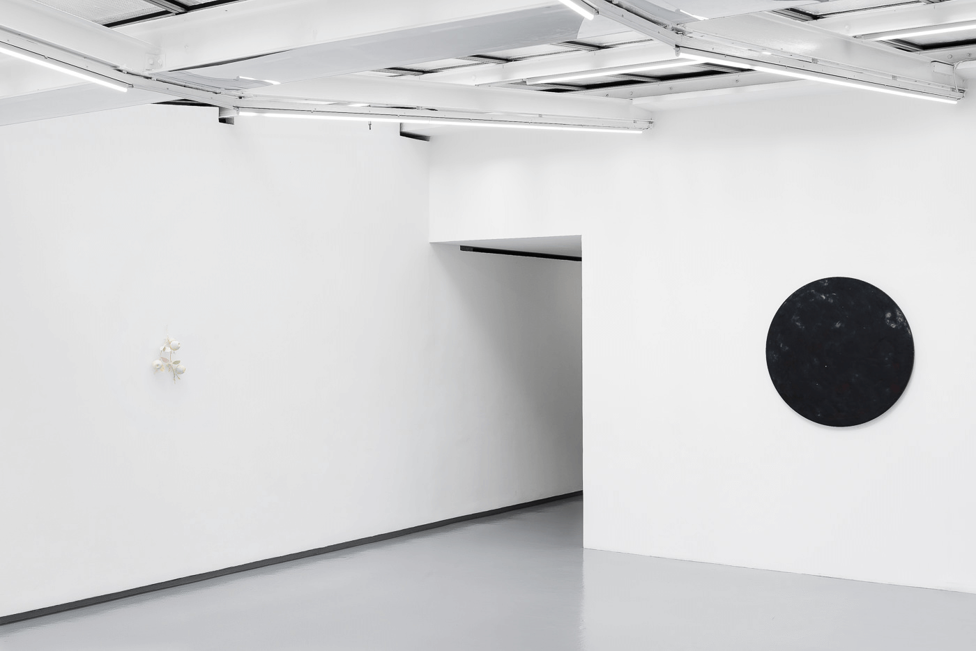
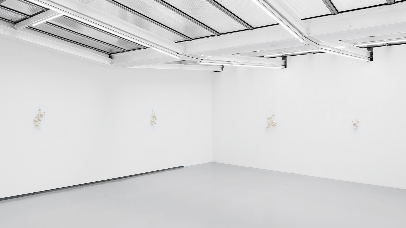
Of course it’s true. I never considered myself an easel painter, where I would chose the five best paintings amongst the past few months of production in a space that has five walls. Every show depends heavily on the physical quality of the space, and most of the time on the broader context: the season, the city, the people I’m showing with. There’s always a kind of narrative I build the show around, and this story is not always told because it’s more of an excuse than a clear demonstration. Even if the titles are an indication of that hidden story. It’s crucial to me that what I offer to the viewer remains as open as it can be, open to interpretation and all sorts of feelings. All of my work is about that, about facilitating feelings and allowing the viewer to be responsive. Working on the scale of the space itself, on the architecture and physical movement of the viewer; by balancing void and fullness, playing with perception, this allows the viewer to get that my work is not made from single works but from a whole universe with many parts.


Responses